The Psychology of Color in Branding and Emotional impact of colors
Dec 16, 2024
3 min read
Have you ever wondered why certain brands feel exciting and energetic, while others come across as calm and trustworthy? A big part of the answer lies in color. Yes, the colors a brand uses aren’t just for decoration they’re a silent language that communicates with our emotions and perceptions.
Let’s dive into the fascinating world of color psychology and see how it shapes branding decisions.
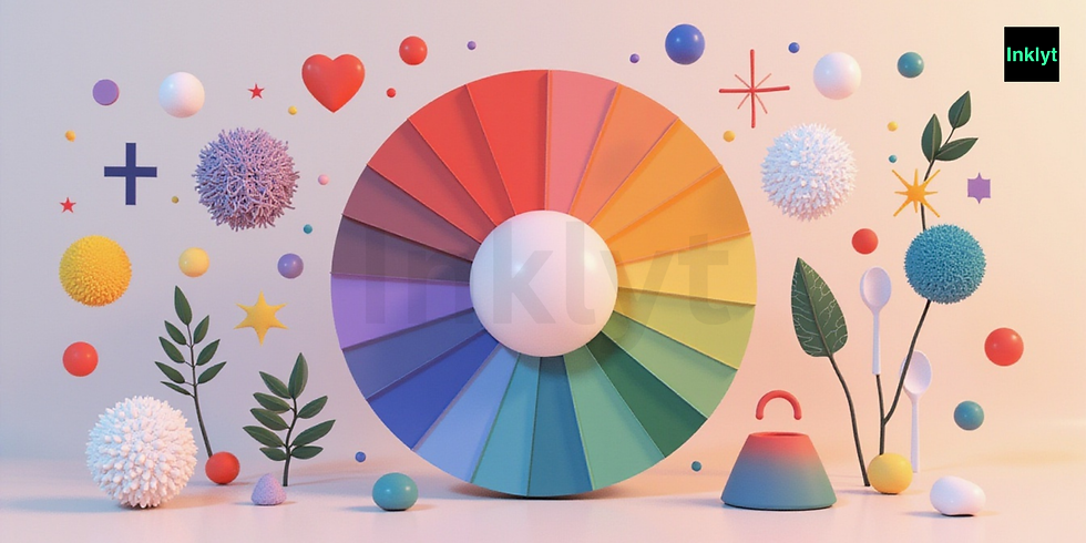
Emotional impact of colors
Why Do Colors Matter in Branding?
Colors trigger emotions and create associations in our minds. Think about it when you see red, you might think of energy, passion, or even urgency. On the other hand, blue often makes us feel calm, stable, and secure.
Brands use these emotional triggers to connect with their audience on a deeper level. The right color palette can:
Convey a brand’s personality.
Influence customer decisions.
Make a brand instantly recognizable.
What Different Colors Mean
Here’s a quick guide to what some popular colors represent and how they’re used in branding:
Red: Energy, passion, and excitement.
Think of brands like Coca-Cola and Red Bull. They use red to grab attention and evoke strong emotions.
Perfect for brands that want to be bold and stand out.
Blue: Trust, calm, and professionalism.
Banks and tech companies like Facebook and LinkedIn love blue because it feels reliable and secure.
It’s a go-to color for industries that want to build trust.
Yellow: Optimism, happiness, and warmth.
Brands like McDonald’s and IKEA use yellow to feel approachable and friendly.
Ideal for companies that want to spread positivity.
Green: Nature, growth, and health.
Think of Whole Foods or Starbucks. Green often represents sustainability and freshness.
Perfect for eco-friendly or wellness brands.
Black: Luxury, power, and sophistication.
High-end brands like Chanel and Nike use black to exude elegance and authority.
Best for premium or minimalist aesthetics.
Orange: Energy, fun, and creativity.
Brands like Fanta and Harley-Davidson use orange to show they’re dynamic and adventurous.
Great for brands targeting a youthful audience.
Purple: Royalty, creativity, and mystery.
Cadbury and Hallmark use purple to feel premium and imaginative.
Ideal for brands wanting to appear unique or indulgent.
How Brands Choose Their Colors
When building a brand, choosing colors isn’t random. Companies often consider:
Target Audience: Who are they trying to attract?
Younger audiences might respond to vibrant colors like orange or yellow.
Older or professional groups might prefer blue or black.
Industry Norms: What do competitors use?
Tech companies often stick to blue for trust and innovation.
Food brands lean toward red and yellow to stimulate appetite and excitement.
Brand Personality: What vibe do they want to convey?
Fun and energetic? Go for bold colors.
Calm and reliable? Stick to softer tones.
Can Colors Really Influence Buying Decisions?
Yes! Studies show that 90% of snap judgments about products are based on color alone. For instance:
A fitness brand might use red to convey energy and power.
A luxury skincare brand may lean on gold and black to feel premium.
This is why choosing the right colors can make or break a brand’s first impression.
How Inklyt Uses Color
At Inklyt, we believe in the power of bold and colorful ideas. When designing for brands, we carefully pick colors that reflect their story and values. For example:
A startup aiming to disrupt the market might get a bold color palette to feel fresh and daring.
A learning platform might use calm, welcoming colors to make users feel at ease.
Tips for Choosing Colors for Your Brand
If you’re thinking of building a brand, here are some tips:
Know Your Audience: Choose colors that resonate with the people you want to reach.
Keep It Simple: Don’t overwhelm with too many colors; stick to 2-3 primary shades.
Be Consistent: Use the same colors across your logo, website, and social media to build recognition.
Colors are more than just visual elements they’re storytellers that speak directly to our emotions. Whether you’re a budding entrepreneur or a well-established business, understanding the psychology of color can help you create a brand that truly connects with people.
So next time you see a logo or ad, take a moment to notice the colors. What are they trying to say? And if you’re building your own brand, don’t just pick your favorite shade choose the one that tells your story best.
.png)
Comments